I used to think my bedroom had to stay neutral to feel calm, like those magazine-perfect spaces with beige throws and whisper-soft palettes that somehow always looked untouched. But one random weekend, I swapped out my plain white bedding for something bold and unexpectedly vibrant, and wow—everything changed. The room felt alive, like it finally had a personality that matched mine instead of hiding it. It wasn’t just about color; it was about energy, mood, and that cozy spark that makes you actually want to crawl into bed at the end of the day. Ever notice how the smallest switch can totally shift how a space feels?
The funny thing is, I didn’t plan to fall in love with colorful bedding—it just kind of happened when I found a set that felt too pretty to ignore. At first, I worried it might be “too much,” like I was breaking some invisible design rule, but honestly, who even makes those rules? Once I saw how the colors played with the sunlight in the morning and warmed up the room at night, I was sold. It made me realize that bedrooms shouldn’t just be calm—they should feel personal, expressive, and a little bit joyful too. Because let’s be real, why settle for boring when your space could feel this good?
Since then, I’ve experimented with different colors, patterns, and textures, and every change taught me something new about how powerful bedding can be. It’s not just a layer on your bed; it’s the heart of the room, setting the tone for everything else around it. Whether you’re into soft pastels or bold, statement-making hues, there’s a way to make color work without overwhelming your space. So if your bedroom feels a little flat lately, maybe it’s time to switch things up and bring in some life. Trust me, once you start, you won’t want to go back.
Bold Rainbow Layers
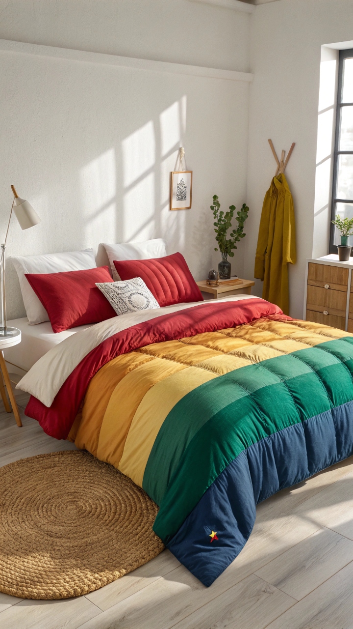
There’s something unapologetically joyful about layering rainbow-colored bedding that instantly lifts the mood the second you walk into the room, like stepping into a space that refuses to take itself too seriously. I tried this once on a whim, mixing bright reds, sunny yellows, calming blues, and a splash of green, and somehow it all worked together like a perfectly messy masterpiece. The key is balance—letting each color have its moment without overpowering the others, creating that playful harmony that feels effortless but still intentional. Doesn’t it just make you smile thinking about waking up surrounded by that kind of color? It’s bold, yes, but also surprisingly cozy, especially when softened with textured throws or neutral pillows. Honestly, it’s giving main character energy in the best way possible.
Pro Tip: Stick to a consistent fabric type to keep the look cohesive even with multiple colors.
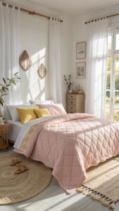
Soft Pastel Dreamscape
Pastel bedding feels like wrapping yourself in a cloud of calm, where soft blush pinks, mint greens, and baby blues gently blend into a soothing palette that never feels overwhelming. I remember switching to pastels during a particularly stressful time, and the difference it made was subtle but powerful—it was like my room exhaled with me. These tones reflect light beautifully, making even a small bedroom feel airy and open while still adding just enough color to keep things interesting. Have you ever noticed how pastels seem to glow differently depending on the time of day? That’s part of their magic, creating a space that feels alive but still peaceful. It’s soft, it’s dreamy, and honestly, it’s such a vibe.
Pro Tip: Pair pastel bedding with white or cream sheets to enhance the light, airy effect.
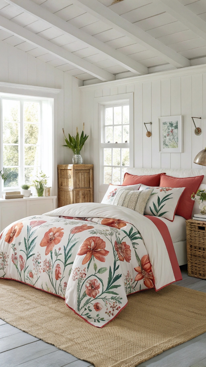
Tropical Floral Explosion
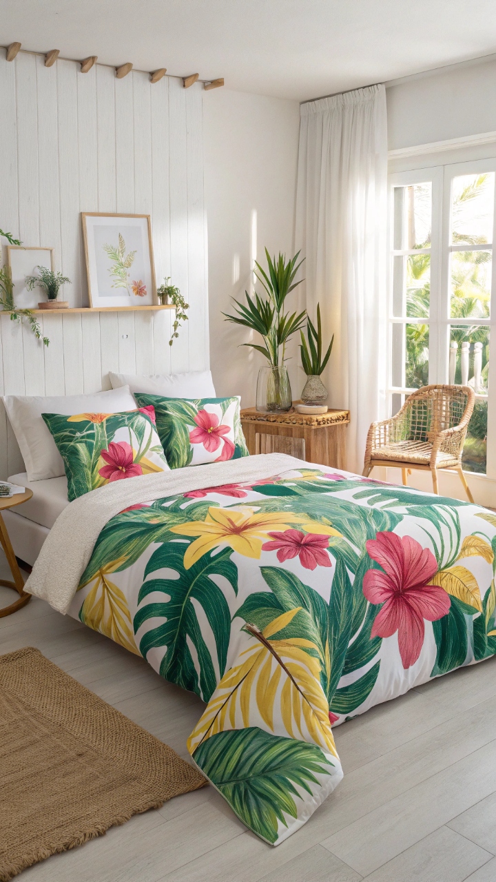
Tropical floral bedding brings in that lush, vacation-like energy that instantly transforms your bedroom into a mini getaway, even if you’re just five steps from your kitchen. I once chose a bold floral print with oversized leaves and vibrant blooms, and suddenly my space felt warmer, brighter, and way more alive. The mix of greens, pinks, and yellows creates a layered look that feels dynamic without needing much else around it. Doesn’t it feel amazing when your bedroom gives you that little escape every time you walk in? It’s like waking up somewhere sunny, even on the most ordinary mornings. And honestly, who wouldn’t want that?
Pro Tip: Keep surrounding decor simple so the floral bedding stays the star of the room.
Deep Jewel Tone Elegance
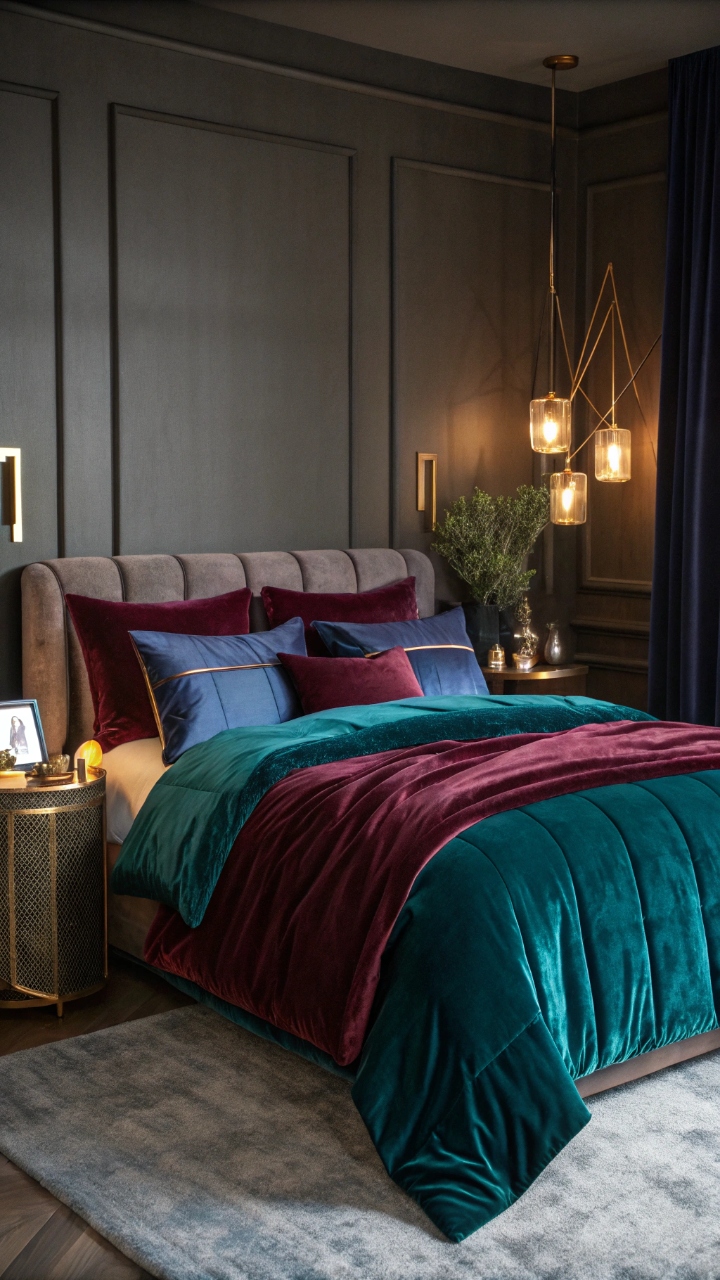
There’s something incredibly rich and luxurious about jewel-toned bedding—think deep emerald greens, sapphire blues, and velvety burgundy shades that instantly elevate the entire space. I tried this look during a room refresh, and it felt like I upgraded my bedroom overnight without changing anything else. These colors absorb light in a way that creates depth and warmth, making the room feel intimate and cozy rather than dark. Have you ever noticed how jewel tones make everything look more expensive? It’s kind of wild, but it works. Add a soft glow from warm lighting, and the whole room feels like a little retreat.
Pro Tip: Use metallic accents like gold or brass to enhance the richness of jewel tones.
Sunshine Yellow Cheer
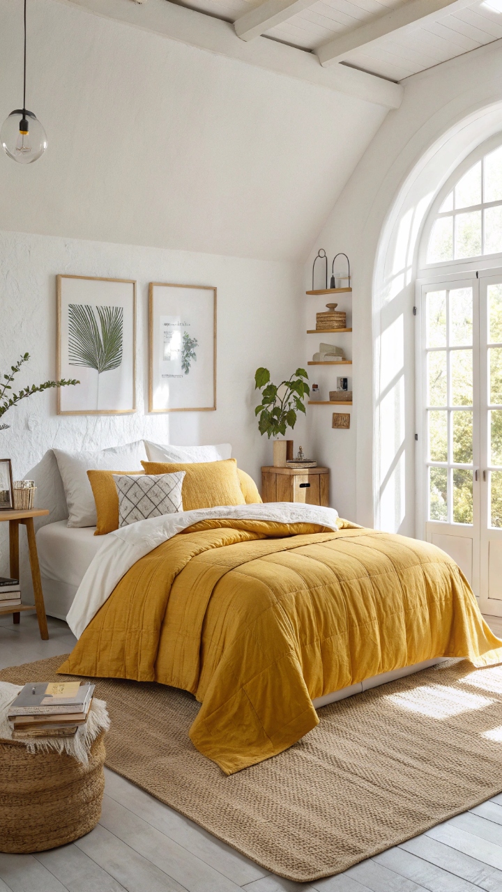
Yellow bedding is pure happiness, no exaggeration—it’s like bringing sunlight into your room even on the grayest days. I remember trying a soft mustard duvet, and it instantly made mornings feel less… ugh, you know? There’s an energy to yellow that feels uplifting without being too loud, especially when paired with neutral textures like linen or cotton. Doesn’t it just make you want to start your day with a little more optimism? It’s cheerful, warm, and surprisingly easy to style if you balance it right. Honestly, it’s one of those colors that just hits different.
Pro Tip: Choose muted or warm yellows instead of neon shades for a more relaxing vibe.
Boho Mixed Patterns
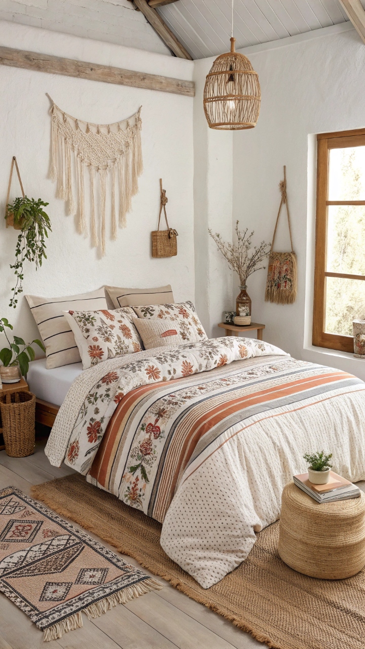
Boho bedding is all about freedom—mixing patterns, colors, and textures in a way that feels curated but never forced, like your bed is telling its own story. I layered stripes, florals, and geometric prints once, and instead of clashing, they created this beautifully relaxed look that felt totally me. The trick is to stick within a general color palette while playing with different designs, giving everything a sense of cohesion. Isn’t it fun when your space feels a little unexpected but still works perfectly? It’s cozy, creative, and just a little bit rebellious in the best way.
Pro Tip: Repeat at least one color across all patterns to tie the look together.
Coral and Teal Contrast
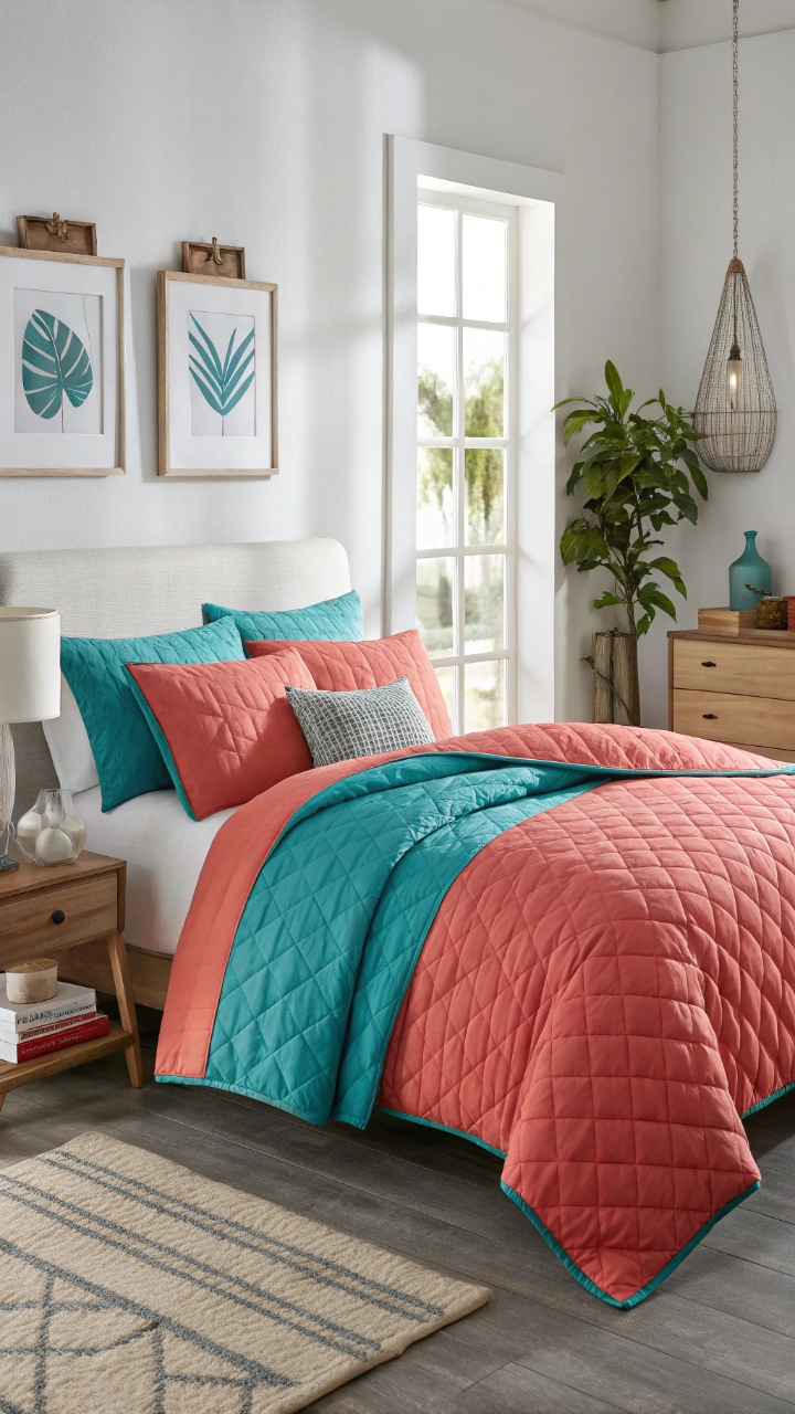
Coral and teal together create a striking contrast that feels both fresh and vibrant, like a perfect balance between warm and cool tones that keeps the eye moving. I didn’t expect to love this combo as much as I did, but once I saw how the colors played off each other, I was hooked. The coral adds warmth and energy, while the teal grounds the look with a calming depth. Doesn’t that contrast just make everything pop in the most satisfying way? It’s bold without being overwhelming, and honestly, it’s such a fun combo to experiment with.
Pro Tip: Use one color as the main base and the other as an accent to avoid visual overload.
Monochrome Color Layers
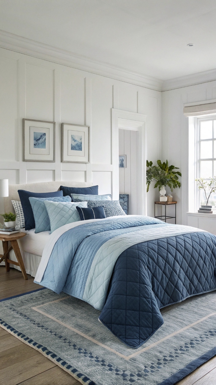
Choosing one color and layering it in different shades might sound simple, but it creates a surprisingly rich and sophisticated look that feels anything but basic. I tried an all-blue palette once, mixing light sky tones with deep navy accents, and the result was incredibly calming yet visually interesting. The variation in shades adds depth while keeping everything cohesive, making the room feel intentional and polished. Have you ever noticed how sticking to one color can actually make a bigger impact? It’s subtle, but it works so well.
Pro Tip: Incorporate different textures to keep a monochrome palette from feeling flat.
Playful Polka Dots
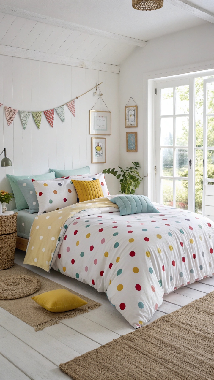
Polka dot bedding adds a touch of whimsy that instantly lightens the mood of your bedroom, like a playful nod to fun without going over the top. I added a dotted duvet once, and it completely changed the energy of the space—it felt more relaxed, less serious, and honestly, more inviting. The pattern works well in both bold and subtle color combinations, depending on how much you want it to stand out. Doesn’t it feel refreshing to have something a little quirky in your space? It’s cheerful, unexpected, and just plain fun.
Pro Tip: Pair polka dots with solid-colored pillows to balance the look.
Warm Terracotta Layers
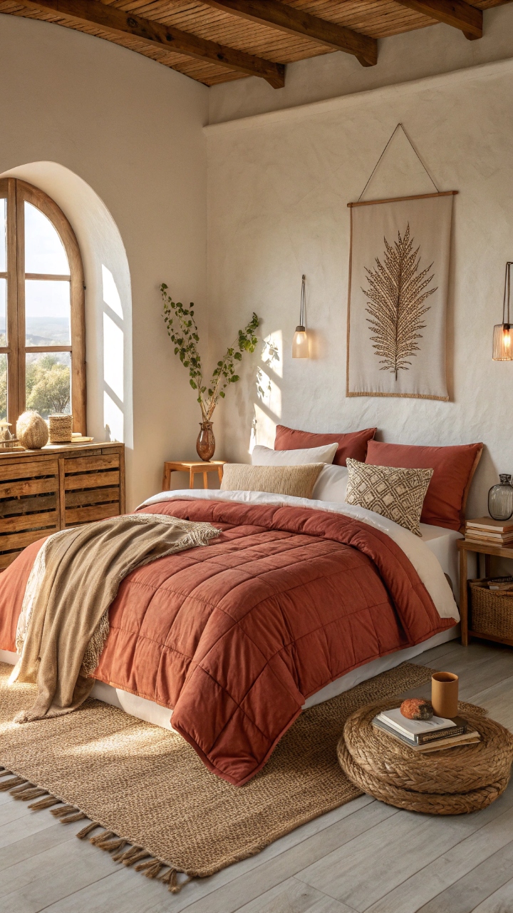
Terracotta bedding brings in earthy warmth that feels grounded and comforting, like wrapping your room in a soft sunset glow. I switched to this palette during a seasonal refresh, and it instantly made my bedroom feel cozier and more inviting. The warm, clay-like tones pair beautifully with natural materials like wood and linen, creating a relaxed, lived-in vibe. Have you ever noticed how earthy colors just make a space feel more real? It’s subtle, but so effective.
Pro Tip: Add cream or beige accents to soften the richness of terracotta tones.
Bright Striped Bedding
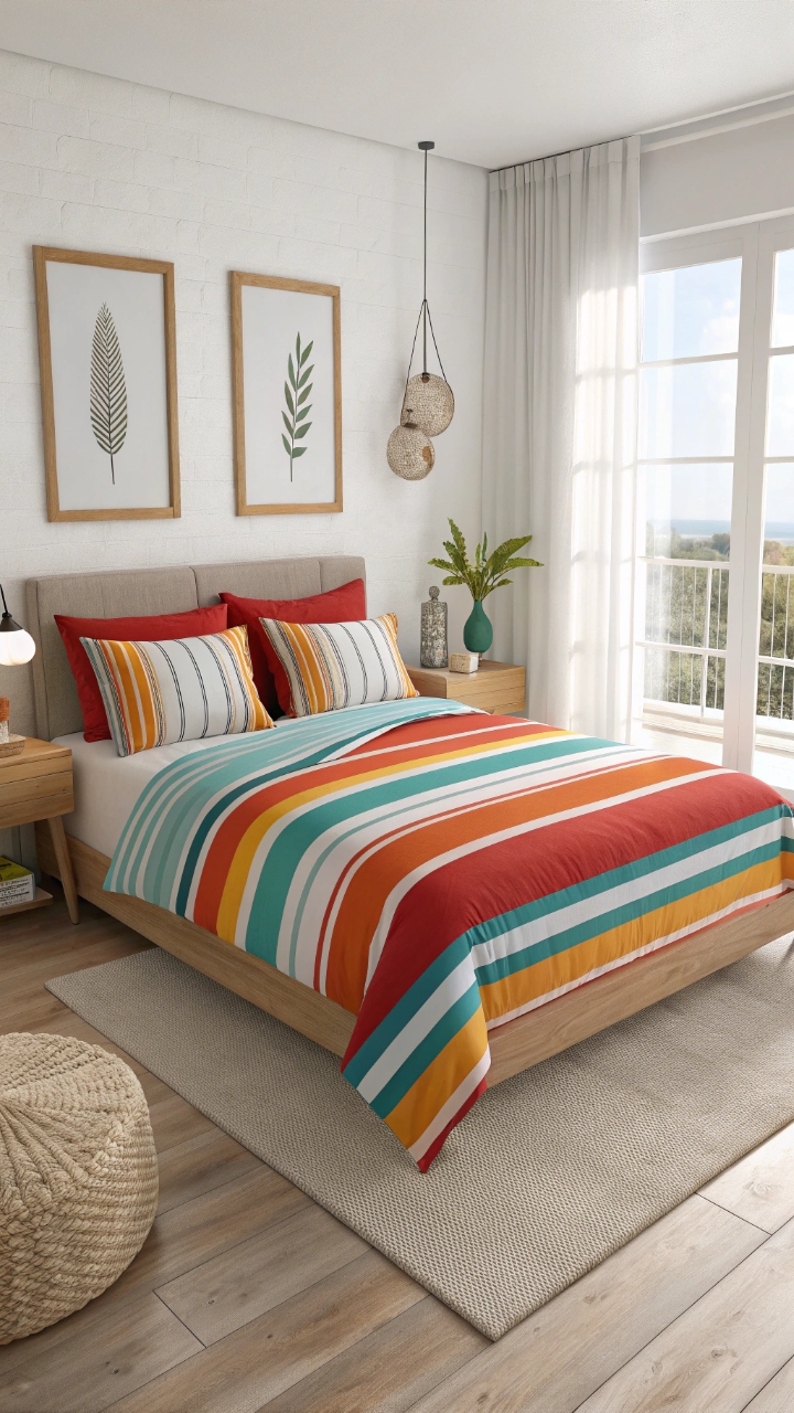
Striped bedding in bold colors creates a dynamic, eye-catching look that instantly energizes your bedroom without needing much else. I remember choosing a set with vibrant, uneven stripes, and it felt like the whole room came alive overnight. The lines draw your eye across the bed, making the space feel larger and more structured at the same time. Isn’t it amazing how something as simple as stripes can make such a big impact? It’s playful, modern, and super versatile.
Pro Tip: Match stripe colors with small decor elements for a cohesive feel.
Lavender Calm
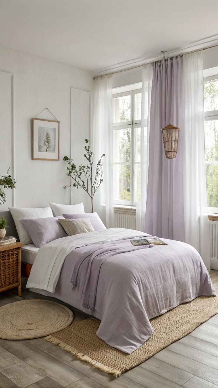
Lavender bedding brings a soft, calming energy that feels both soothing and slightly luxurious, like a gentle retreat from the chaos of everyday life. I tried this color during a particularly busy season, and it genuinely helped create a more peaceful atmosphere at home. The subtle purple tones add just enough color without overpowering the space, making it feel balanced and serene. Doesn’t that kind of calm sound exactly like what a bedroom should be? It’s understated, but beautiful.
Pro Tip: Pair lavender with gray or white for a clean, calming palette.
Color Block Design
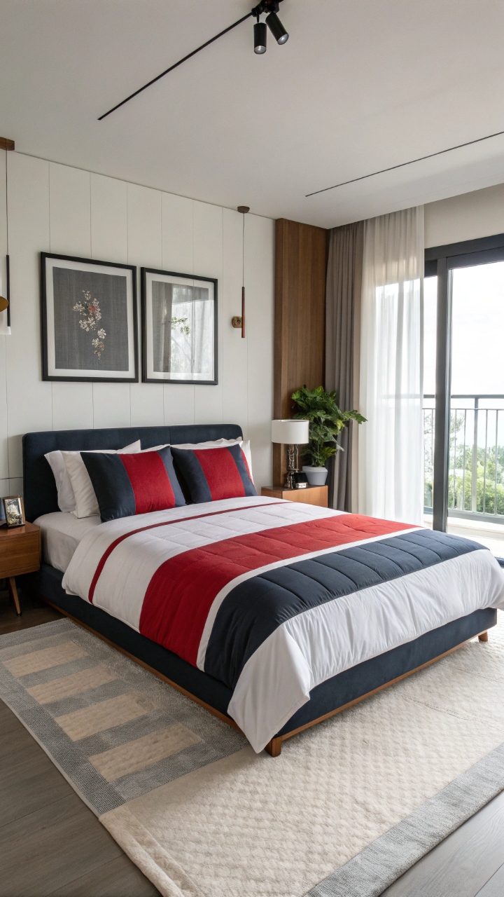
Color block bedding is bold, modern, and a little edgy, combining solid sections of contrasting colors to create a striking visual statement. I experimented with this style when I wanted something different, and it completely transformed the look of my bed into a focal point. The clean lines keep it from feeling chaotic, even with strong color combinations. Have you ever noticed how structured designs can still feel fun? It’s the perfect mix of playful and polished.
Pro Tip: Stick to 2–3 colors to maintain a clean, modern look.
Floral and Solid Mix
Combining floral bedding with solid-colored layers creates a balanced look that feels both lively and grounded, like the best of both worlds. I paired a bold floral duvet with simple neutral sheets, and it instantly toned down the pattern while still letting it shine. The contrast keeps the space from feeling too busy, giving your eyes a place to rest. Doesn’t that kind of balance just make everything feel more put together? It’s effortless, but so effective.
Pro Tip: Choose solids that match a color within the floral pattern for cohesion.
Neon Accent Touch
Adding neon accents to your bedding might sound a little daring, but when done right, it creates a fun, energetic vibe that feels modern and unique. I tried this with small neon details against a neutral base, and it added just the right amount of edge without overwhelming the space. The brightness pops in a way that feels intentional rather than chaotic, giving your room a fresh, youthful energy. Isn’t it fun to push your comfort zone just a little? Sometimes that’s where the magic happens.
Pro Tip: Use neon sparingly as an accent rather than the main color.
Conclusion
Bringing color into your bedroom through bedding isn’t just about aesthetics—it’s about creating a space that feels alive, personal, and deeply comforting in a way that reflects who you are. When I started experimenting with color, I realized how much it influenced my mood, my energy, and even how I experienced simple routines like waking up or winding down at night. Each shade, pattern, and texture tells its own story, and when you find the right combination, it feels like your room finally clicks into place. It’s not about perfection or following trends—it’s about what makes you feel at home. And honestly, that’s what makes all the difference.
The beauty of colorful bedding is that it’s one of the easiest ways to transform your space without a full redesign, giving you the freedom to experiment and evolve your style over time. You can go bold, keep it soft, or mix things up depending on your mood, and that flexibility makes it such a powerful design tool. Have fun with it, try something unexpected, and don’t be afraid to step outside your comfort zone just a little. Because sometimes, that one simple change can make your bedroom feel brand new again. And who doesn’t love that feeling?