The Heart pattern painting I made started as a tiny filler project on a blank scrap canvas I almost tossed aside. I dipped a brush into pink paint, repeated one simple heart shape a few times, and somehow ended up with something so sweet I kept it on my desk for months. That is what made me love heart pattern art in the first place. It is simple, playful, and weirdly hard to mess up. Even the easiest designs feel charming once the pattern starts coming together.
What I love most about heart pattern paintings is how easy they are to make look cute without needing perfect technique. A repeated shape does most of the work, and once you start layering colors, spacing, or little details, the whole thing takes on its own personality. Some designs feel soft and romantic, others more playful or modern, but all of them have that cheerful handmade feel that makes them fun to paint. And honestly, they are kind of addictive once you start. One little row turns into a whole canvas real fast.
Now, I always think heart pattern paintings are one of the easiest ways to make something cute, colorful, and handmade without overthinking it. They work on canvases, cards, wall art, and even little gift projects, and they always end up looking sweet no matter the style. Whether you love soft pastels, bold color, or playful patterns, these heart painting ideas are simple to try and ridiculously cute once finished. Let’s get into some heart-filled ideas worth painting.
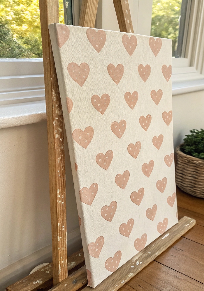
1. Soft Pink Repeating Hearts
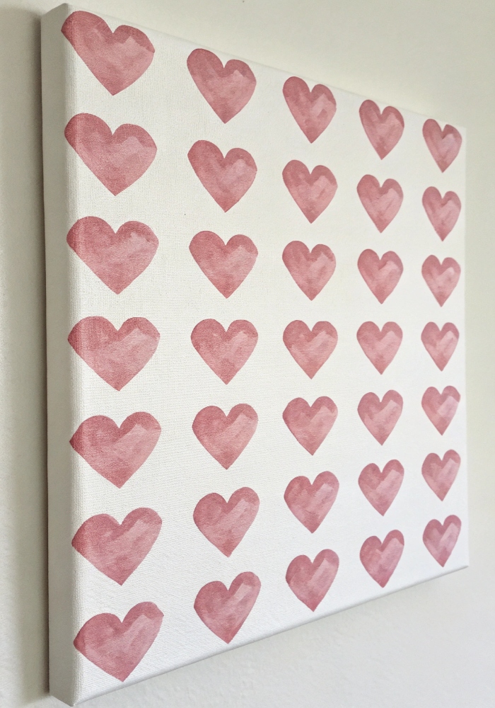
I painted rows of soft pink hearts across a white canvas, and the whole thing instantly looked sweet, simple, and charming without needing anything else. The repeated shape keeps it playful while the soft pink makes it feel gentle and light. It looks delicate, cheerful, and easy in the prettiest way. The whole pattern feels calm and cute right away. Isn’t soft pink always the easiest place to start? Pro Tip: Keep heart spacing slightly uneven for a more handmade look.
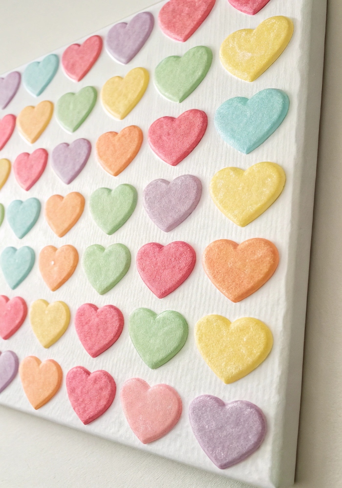
2. Rainbow Heart Grid
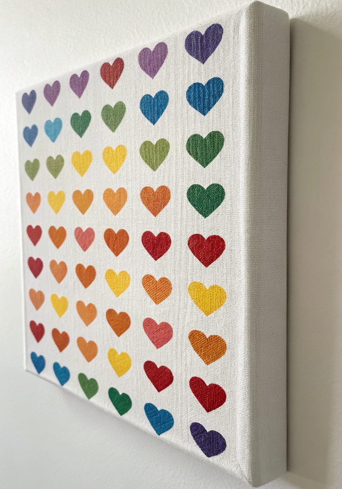
I painted tiny hearts in rainbow rows, and the whole canvas instantly felt brighter, happier, and full of playful energy. The color variation keeps the pattern lively while the neat grid makes everything feel balanced. It looks cheerful without feeling messy and playful without trying too hard. The whole piece feels upbeat and fun. Doesn’t rainbow anything just make a painting feel happier? Pro Tip: Use one brush size for cleaner repetition.
3. Mini Hearts on Pastel Background
I added tiny white hearts over a soft pastel background, and the whole painting came out looking dreamy, delicate, and ridiculously cute. The small hearts keep the pattern subtle while the pastel adds softness and charm. It feels sweet, airy, and easy to style anywhere. The whole piece has that soft handmade look that always works. Could anything be cuter than tiny hearts on pastel? Pro Tip: Let the background dry fully before adding hearts.
4. Scattered Watercolor Hearts
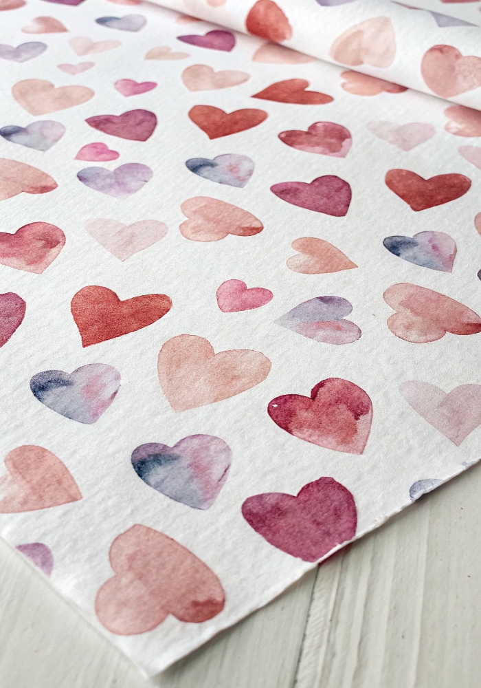
I painted loose watercolor hearts across the page, and the soft edges made the whole pattern feel light, playful, and a little dreamy. The uneven shapes give it movement and charm without needing perfect lines. It feels gentle, artsy, and relaxed in the nicest way. The watercolor softness makes everything look extra sweet. Isn’t that little bit of blur what makes watercolor so cute? Pro Tip: Use more water for softer edges.
5. Red and Pink Heart Checkerboard
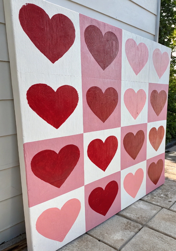
I alternated red and pink hearts in a checkerboard pattern, and the whole piece instantly felt playful, bold, and full of personality. The color contrast adds energy while the repeated shape keeps it cute and balanced. It feels fun, bright, and just a little retro in the best way. The whole pattern pops right away. Isn’t this one such a fun little vibe? Pro Tip: Sketch a light grid first for cleaner spacing.
6. Tiny Gold Hearts on White
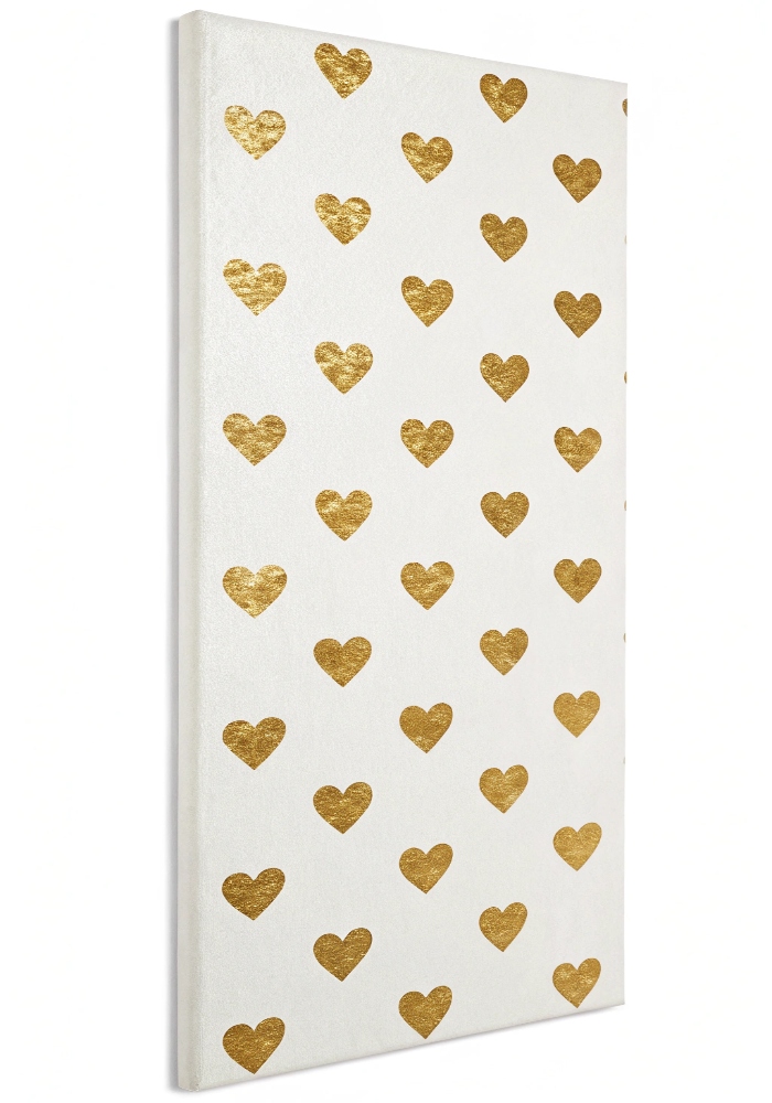
I painted tiny gold hearts across a white background, and the whole thing came out looking soft, minimal, and weirdly elegant for such a simple idea. The metallic shine adds just enough sparkle while the white keeps everything clean and airy. It feels sweet, polished, and very easy to style. The pattern stays subtle but still catches the eye. Doesn’t a little gold make everything feel prettier? Pro Tip: Use metallic paint pen for sharper tiny hearts.
7. Ombre Heart Pattern
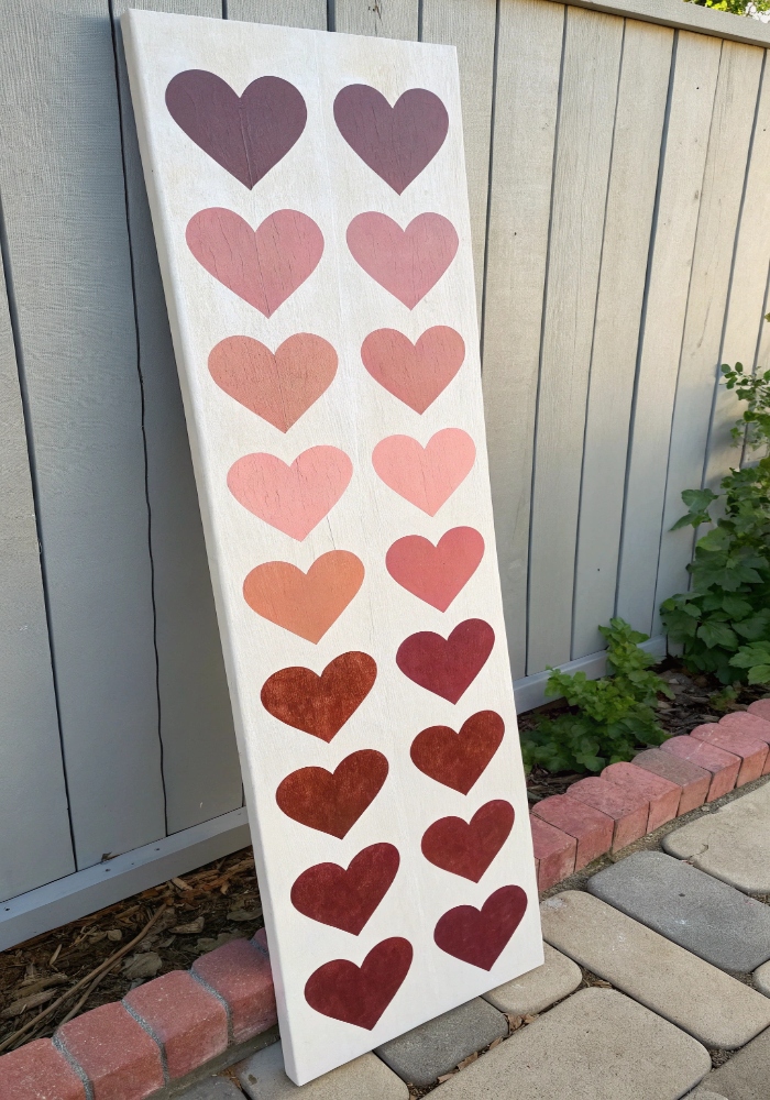
I blended heart colors from dark to light, and the soft ombre effect made the whole painting feel more polished without losing its playful charm. The color fade adds movement while the repeated shape keeps it cute and simple. It feels soft, balanced, and a little more styled than a basic repeat. The whole piece looks extra pretty on display. Isn’t ombre always such an easy upgrade? Pro Tip: Arrange shades before painting to keep the fade smooth.
8. Black and White Graphic Hearts
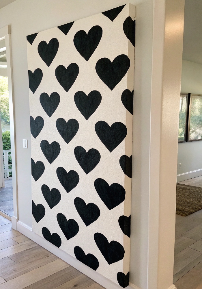
I painted bold black hearts on white, and the contrast made the whole piece feel playful, modern, and kind of cool. The simple palette keeps the pattern clean while the repeated shape adds all the charm. It feels bold, graphic, and super easy to style. The whole thing looks sharp without losing the cute factor. Who knew hearts could look this chic? Pro Tip: Use a fine brush for cleaner edges.
9. Folk Art Heart Pattern
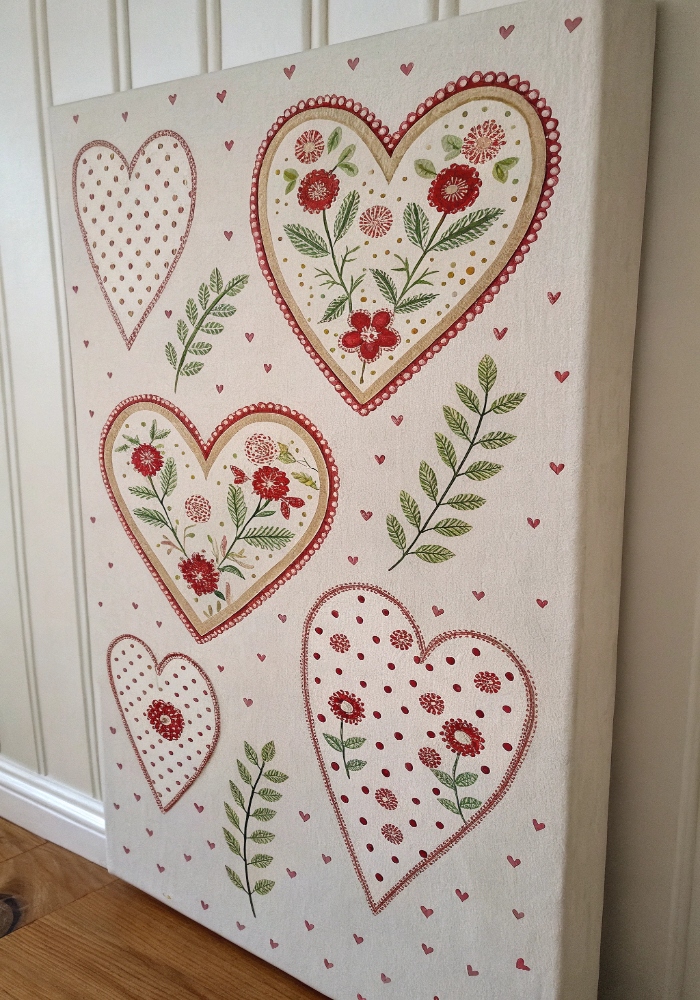
I added little dots and floral details inside each heart, and the whole pattern instantly felt sweeter and full of handmade charm. The extra detail gives each heart more personality while keeping the design playful. It feels decorative, cozy, and a little whimsical in the best way. The whole piece has that cottagey handmade feel. Isn’t this one just darling? Pro Tip: Keep details simple so the pattern stays readable.
10. Heart Polka Dot Pattern
I swapped classic dots for tiny hearts, and that one change made the whole pattern feel instantly cuter and more playful. The layout feels familiar, but the heart shape adds charm fast. It looks light, cheerful, and easy to paint without overthinking anything. The whole piece feels fun and simple. Isn’t that the easiest cute upgrade ever? Pro Tip: Use a small stamp for quicker repetition.
11. Candy Color Heart Rows
I painted rows of hearts in candy shades, and the whole canvas instantly felt playful, sweet, and full of cheerful color. The soft mix keeps everything bright without feeling too loud. It feels lighthearted, colorful, and just plain fun to look at. The pattern feels playful from edge to edge. Doesn’t candy color always make things cuter? Pro Tip: Stick to four or five shades for balance.
12. Heart Pattern with Tiny Daisies
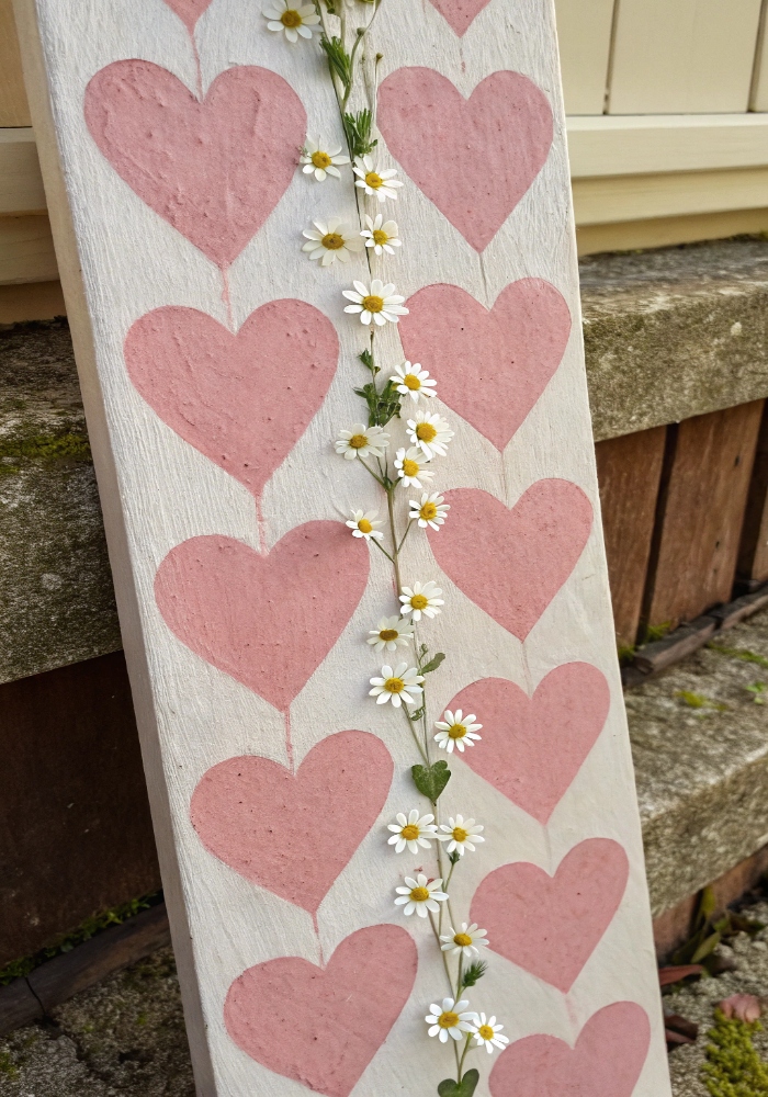
I tucked tiny daisies between rows of hearts, and the whole design instantly felt softer, sweeter, and extra charming. The flowers break up the pattern just enough to keep it playful and light. It feels gentle, cheerful, and very handmade in the best way. The little details make it feel extra cute. Isn’t this one just so stinkin’ cute? Pro Tip: Keep daisies smaller than the hearts for balance.
13. Neutral Heart Pattern Canvas
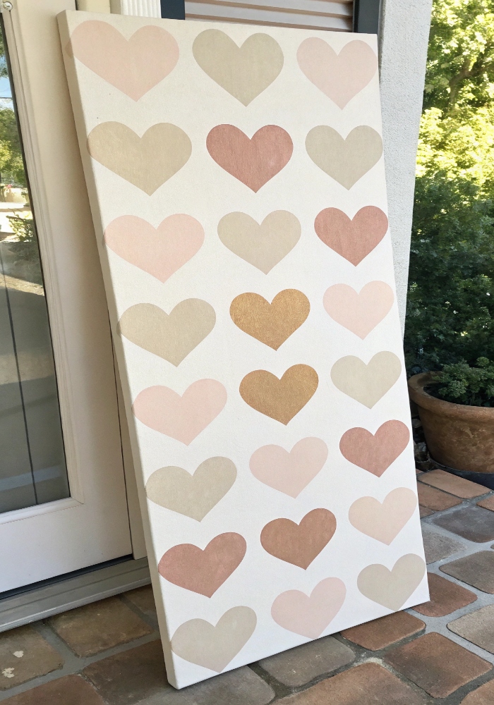
I used soft beige, cream, and blush tones, and the whole heart pattern came out looking calm, sweet, and beautifully minimal. The softer palette keeps the design gentle while the repeated hearts add just enough charm. It feels warm, simple, and easy to style anywhere. The whole piece looks soft and polished. Doesn’t neutral always make things feel a little prettier? Pro Tip: Mix matte shades for a softer finish.
14. Layered Transparent Hearts
I overlapped painted hearts in sheer layers, and the whole pattern ended up looking playful, artsy, and a little more dimensional. The overlap adds movement and depth while keeping the shapes soft and light. It feels fun, modern, and just different enough to stand out. The layered look adds instant interest. Isn’t this such a fun twist? Pro Tip: Thin paint slightly for a translucent effect.
15. Heart Border Pattern Painting
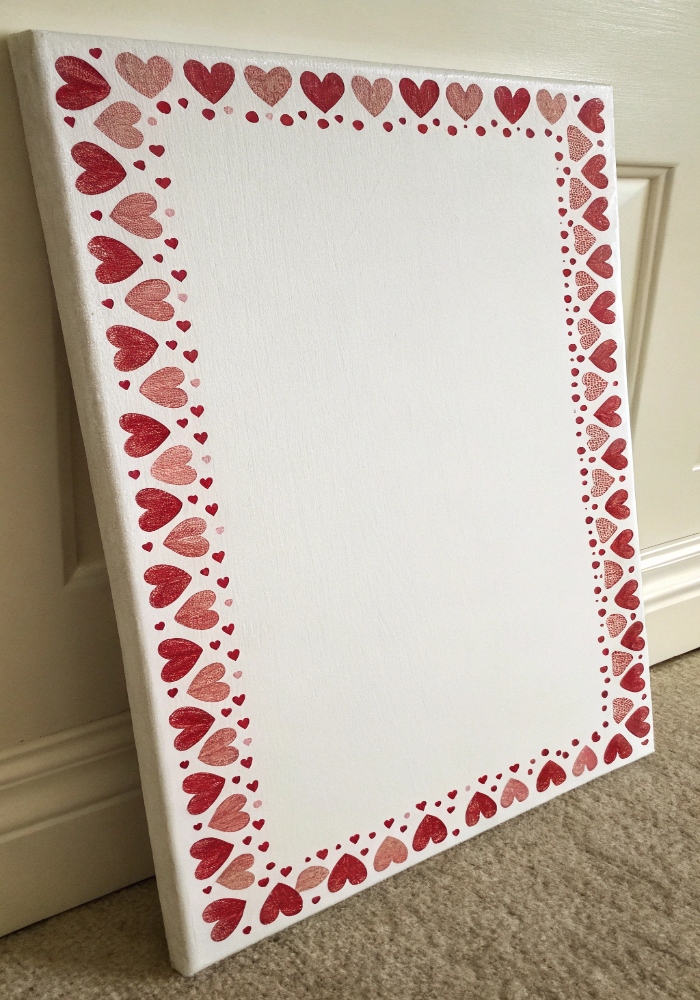
I painted tiny hearts around the edges and left the center blank, and the whole design felt sweet, simple, and perfect for a little framed piece. The border keeps it neat while the open center makes it feel light and balanced. It looks polished, playful, and very easy to personalize. The whole piece feels thoughtful and cute. Isn’t that such a sweet little layout? Pro Tip: Pencil the border lightly first for even spacing.
Conclusion
Heart pattern paintings are one of the easiest ways to make something playful, sweet, and handmade without needing complicated supplies or perfect technique. These ideas show how one simple shape can turn into something colorful, charming, and full of personality with just a little repetition. That is what makes them so fun to paint. They stay simple, but never boring. That easy charm is what makes them so cute.
What makes heart patterns so easy to love is how flexible they are. They can feel soft and romantic, playful and bright, or clean and modern depending on the colors and spacing you choose. Even the simplest repeat can end up looking thoughtful once it all comes together. That little bit of pattern does a lot. It is such a fun way to make art feel easy.
As you paint your own, keep the shapes simple, let the colors do the work, and do not overthink the pattern too much. The cutest pieces usually come together when they stay a little playful and a little imperfect. That handmade softness is part of what makes them work. In the end, that is exactly what makes them so charming.