Small living rooms used to stress me out more than I’d like to admit, especially when I first moved into a place where the walls felt a little too close and the natural light had to “fight” its way in. I remember sitting on the floor with coffee, thinking, how do people make tiny spaces look like magazine spreads without it feeling fake or overdone? That’s when I fell into mid century modern design, and honestly, it changed everything about how I see space. It wasn’t about adding more—it was about choosing better.
Over time, I started noticing how certain homes felt instantly calm even when they were small, like they had room to breathe without being empty. Clean lines, warm woods, and thoughtful layouts became my quiet obsession, and I began experimenting in my own living room like it was a personal design lab. Some attempts were a little “meh,” not gonna lie, but others? Total game changers that made the room feel twice its size.
Now I always think of small mid century modern spaces as puzzles that just need the right pieces instead of more pieces. Every furniture choice, every color, every texture either opens the room up or quietly shrinks it. And once you get the hang of it, it feels kind of addictive—in the best way possible.
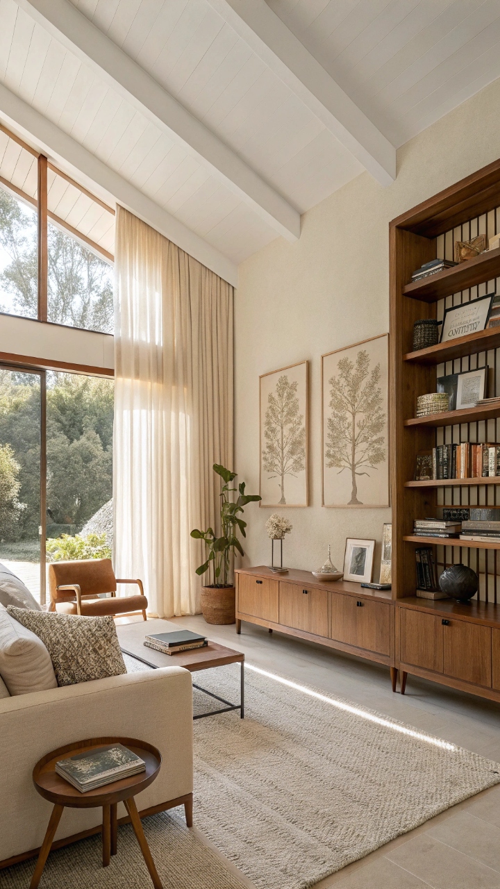
Warm Light Wood + Neutral Palette Balance
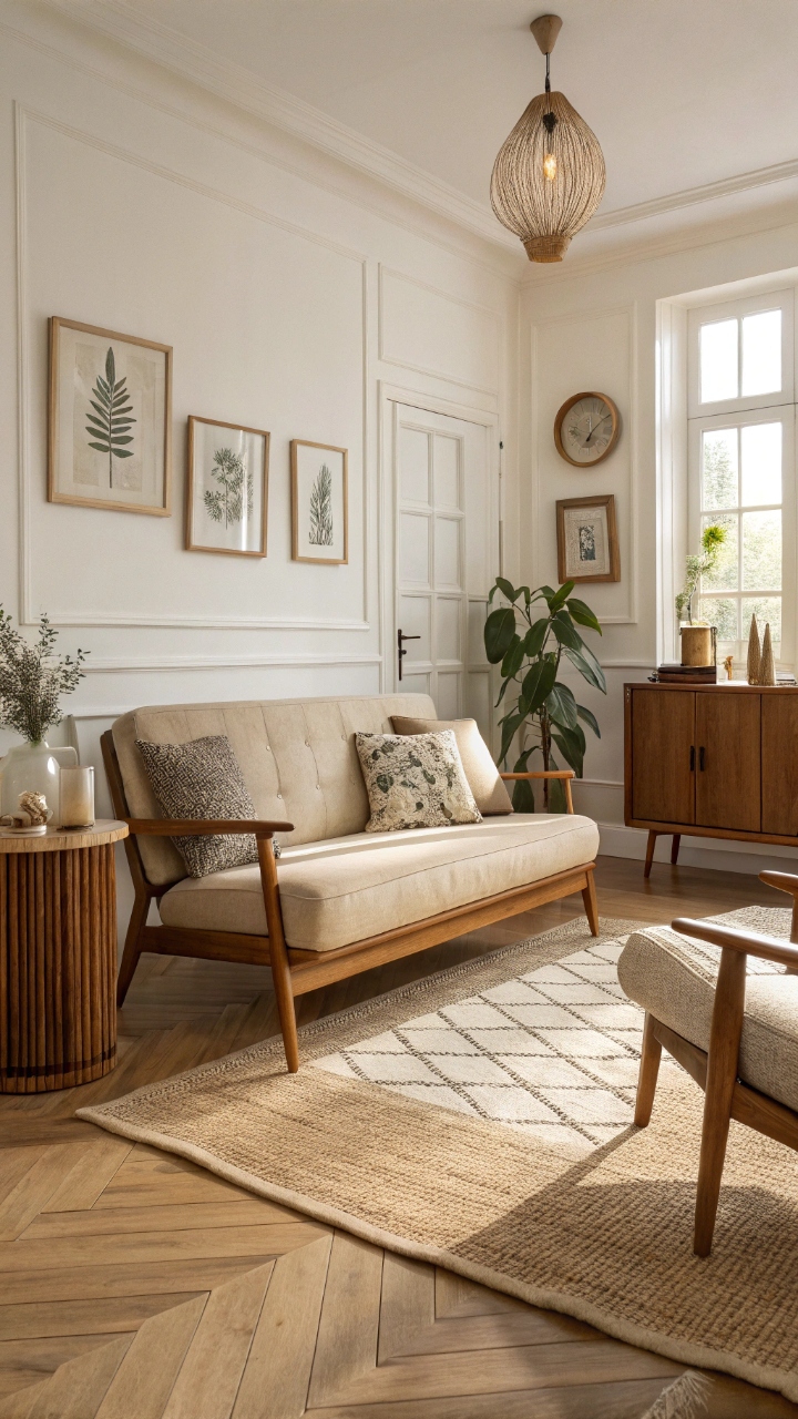
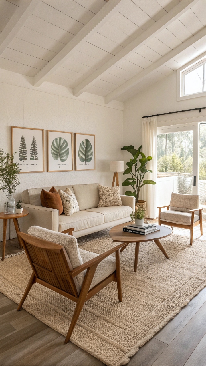
When I first leaned into warm light wood tones, I noticed my living room stopped feeling heavy and started feeling like it could actually breathe, which honestly felt like magic at first. Soft oak, walnut accents, and beige tones instantly created a sense of openness that white walls alone never gave me. It’s wild how a simple shift in material can completely change the emotional weight of a room, don’t you think? The space suddenly felt less cluttered even when nothing physically moved. I started pairing everything back to earthy basics, and the calmness was immediate. The beauty of neutrals is how they let light bounce instead of getting absorbed, especially in small rooms. I noticed mornings felt brighter without adding a single new lamp or fixture. It almost felt like the room was exhaling with me every time I walked in. There’s something deeply grounding about it, like the space stops competing for attention. And honestly, it just works without trying too hard.
Pro Tip: Stick to 2–3 wood tones max and layer soft beige, cream, and warm white to keep the palette intentional and airy.
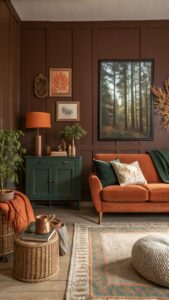
Low-Profile Sofas That Open the Room
Switching to a low-profile sofa was one of those “why didn’t I do this sooner?” moments because it instantly made my ceiling feel higher without any renovation. The lower backrest creates this visual trick that stretches the room upward, which is perfect for tight spaces. I remember thinking, wait… did my living room just grow? It kinda felt like it did. The whole vibe became more grounded but also more open. What I love most is how these sofas don’t block sightlines, so your eyes can travel across the room instead of stopping abruptly. That flow matters more than people realize in small spaces. Even guests tend to comment on how “light” the room feels without knowing why. It’s one of those sneaky design wins that just keeps paying off.
Pro Tip: Choose a sofa with slim legs and low arms to maximize visual space and maintain that mid century modern airiness.
Open-Leg Furniture for Visual Breathing Room
The first time I replaced bulky furniture with open-leg pieces, I literally laughed because the room looked bigger within minutes. Seeing floor space underneath furniture tricks the brain into reading the room as more spacious than it is. It’s such a simple shift, but wow, does it deliver. Suddenly everything felt less boxed in, like the furniture was floating just enough to breathe. Mid century modern design leans heavily into this concept, and it’s easy to see why. Open legs allow light and shadow to move underneath, creating subtle depth throughout the space. Even a small coffee table can change the entire energy of the room. I started noticing how much calmer everything felt just because I could see more floor.
Pro Tip: Prioritize sofas, chairs, and tables with tapered legs to maintain visual openness throughout the room.
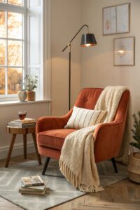
Statement Lighting That Doesn’t Overpower
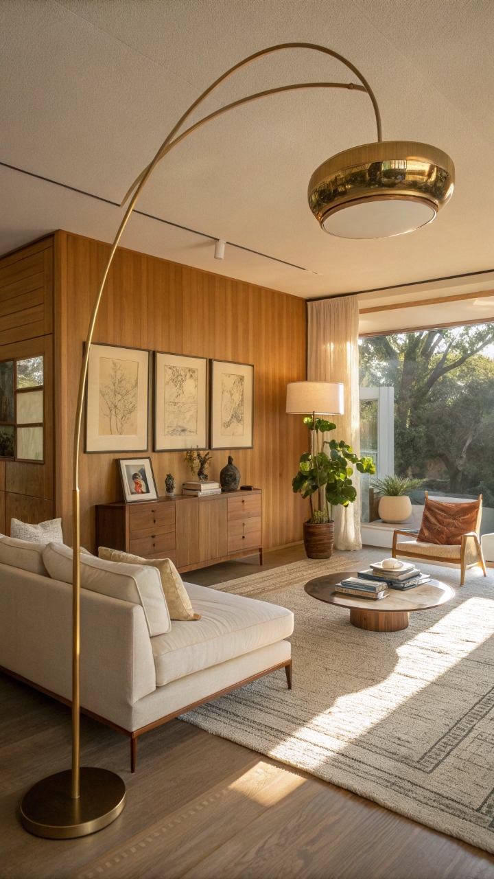
Lighting was my secret weapon once I stopped thinking of it as just “functional.” A sculptural mid century modern pendant or floor lamp can completely redefine a small living room without taking up floor space. I remember installing a brass arc lamp and thinking, okay, this room just leveled up. It felt stylish but still breathable, which is the sweet spot. The key is choosing lighting that draws the eye upward without overwhelming the space. Soft diffusion matters more than brightness here because harsh lighting can shrink a room visually. I tend to go for warm glows that feel like golden hour all day long. It just makes everything softer and more inviting.
Pro Tip: Use one statement light and keep additional lighting minimal to avoid visual clutter.
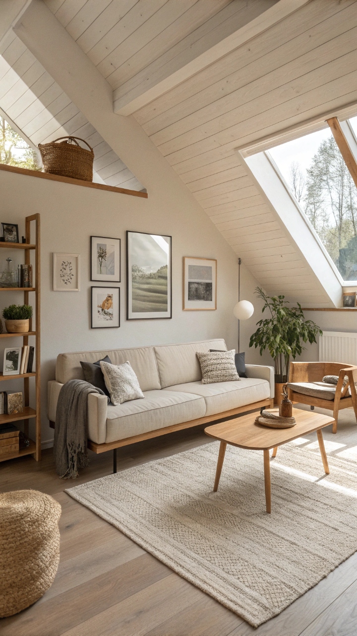
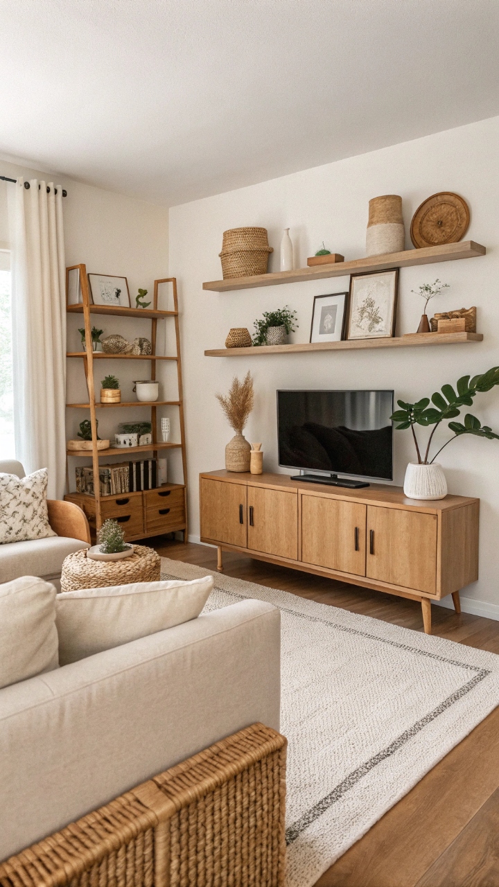
Floating Shelves for Clean Vertical Storage
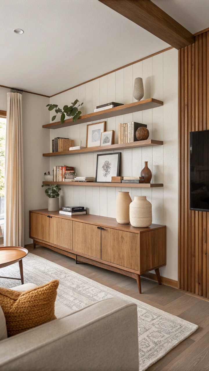
Floating shelves saved my sanity when I realized I didn’t actually need bulky cabinets stealing floor space. They give storage without visually anchoring the room too heavily, which is huge for small spaces. I started styling mine with a mix of books, ceramics, and a few personal pieces, and suddenly the walls felt intentional instead of empty. It was giving “curated but chill,” if that makes sense. The trick is restraint—too much on the shelves defeats the purpose. I learned that the hard way after overstyling one section and immediately regretting it. Now I treat shelves like mini vignettes rather than storage dumps. It keeps everything airy and visually balanced.
Pro Tip: Leave negative space on shelves so the eye can rest and the wall doesn’t feel crowded.
Minimal Wall Art with Intentional Spacing
At one point I used to think more art meant more personality, but in small mid century modern rooms, less actually says more. One or two large-scale pieces create a focal point without overwhelming the walls. I swapped out a gallery wall for a single abstract print, and the difference was honestly shocking. The room felt instantly calmer. Spacing matters just as much as the art itself. Leaving breathing room around frames allows the eye to process each piece properly. I like to think of it as giving the art its own little spotlight moment. And yeah, it just feels more grown-up in a way.
Pro Tip: Choose oversized art instead of multiple small frames to avoid visual fragmentation.
Indoor Plants That Add Soft Movement
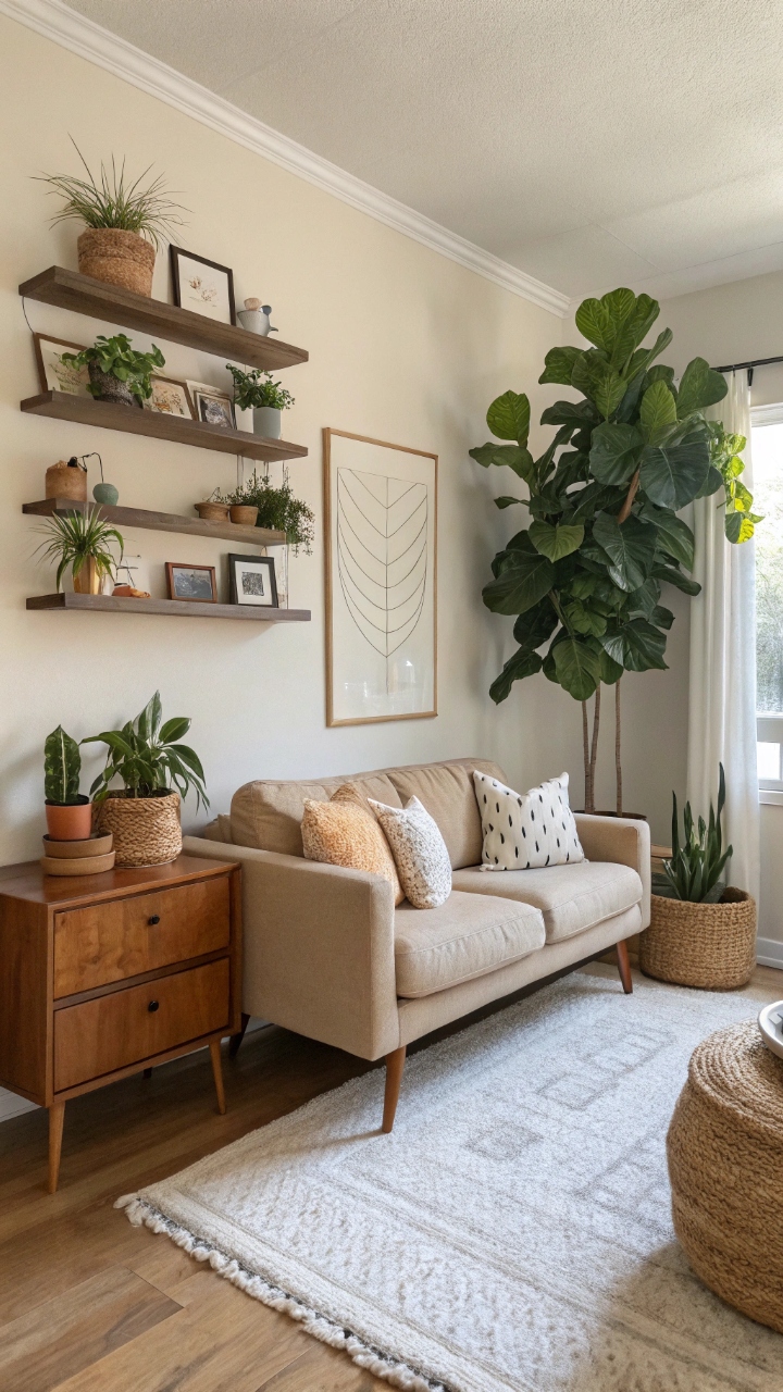
Adding plants was one of those decisions that made the space feel alive in the best way. A tall fiddle leaf fig in the corner softened hard angles instantly, while smaller plants added little pops of movement around the room. It’s crazy how something organic can completely shift the energy of a space. The room stopped feeling static and started feeling lived-in. What I love is how plants introduce height variation without clutter. They draw the eye upward while still feeling light and natural. Even on lazy days, the greenery makes the room feel intentional. It’s like the space is quietly taking care of itself.
Pro Tip: Use tall plants in corners and smaller ones on shelves to create layered natural movement.
Mirrors That Double the Space Visually
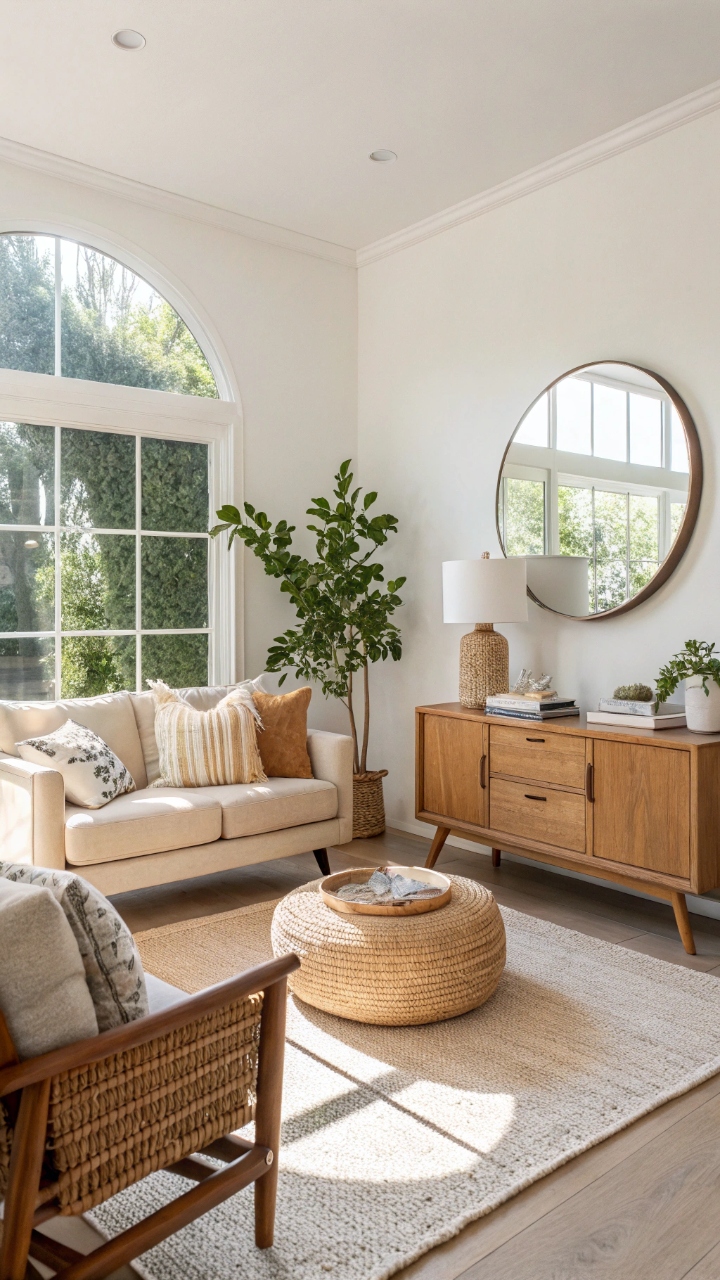
Mirrors are basically cheat codes for small rooms, and I fully stand by that. The first time I placed a large round mirror across from a window, I actually did a double take. Suddenly there was more light, more depth, and this illusion of another room beyond the wall. It felt almost unreal. The trick is placement, not quantity. One well-placed mirror can do more than several small ones scattered around. I like positioning them where they reflect natural light or a nice focal point. It’s such a simple move, but it changes everything.
Pro Tip: Place mirrors opposite windows or light sources to maximize brightness and depth.
Multi-Functional Furniture That Works Harder
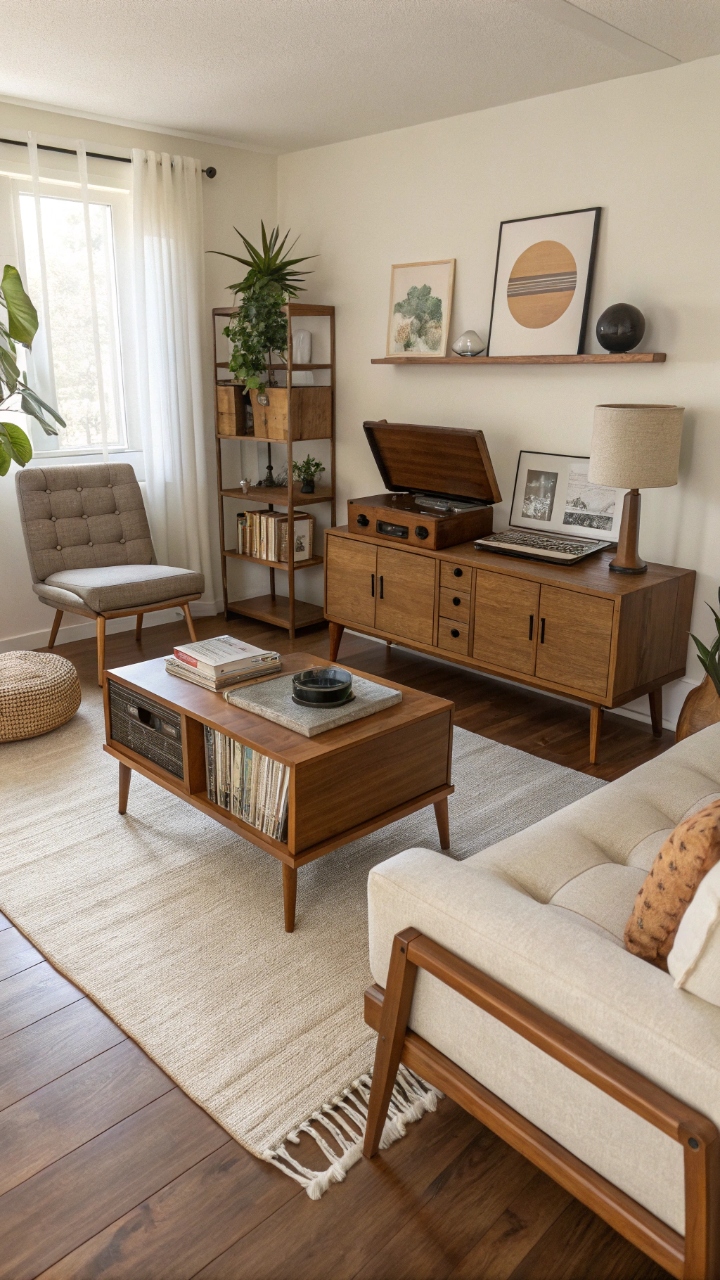
Small spaces don’t forgive wasted furniture, so every piece needs to earn its place. I started using ottomans with storage and coffee tables that could double as workspaces, and suddenly the room felt more flexible. It’s like the furniture started doing double duty without complaining. Honestly, it’s a total win. Mid century modern design naturally supports this idea with its clean, practical shapes. Nothing feels overly complicated or bulky. I like how everything serves a purpose while still looking stylish. It just makes life easier.
Pro Tip: Choose furniture that serves at least two functions to reduce clutter without sacrificing style.
Rugs That Define Without Closing In
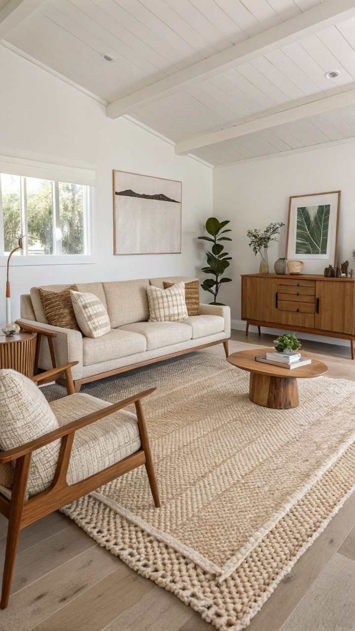
A rug can either open a room or trap it, and I learned that the hard way. When I switched to a larger rug that anchored my seating area, everything suddenly felt more cohesive. Instead of breaking the space into tiny zones, it unified everything. It was a subtle shift but a powerful one. Mid century modern spaces benefit from simple, low-pattern rugs that don’t compete visually. Texture matters more than busy designs here. I like soft weaves that feel warm but still understated. It just pulls the whole room together.
Pro Tip: Use a rug large enough to fit under front legs of furniture for a unified layout.
Glass Coffee Tables for Light Flow
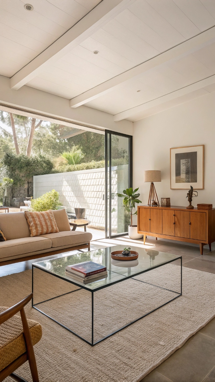
Switching to a glass coffee table felt like removing visual weight from the center of my room. It still functioned perfectly but didn’t block sightlines or crowd the space. I remember thinking, why does this suddenly feel so much bigger? It was such a small change with a big impact. Glass keeps the eye moving instead of stopping abruptly. That flow is everything in small rooms. Even clutter feels lighter when the base is transparent. It’s like design invisibility in the best way.
Pro Tip: Pair glass tops with slim metal frames for a true mid century modern aesthetic.
Hidden Storage That Keeps Chaos Out of Sight
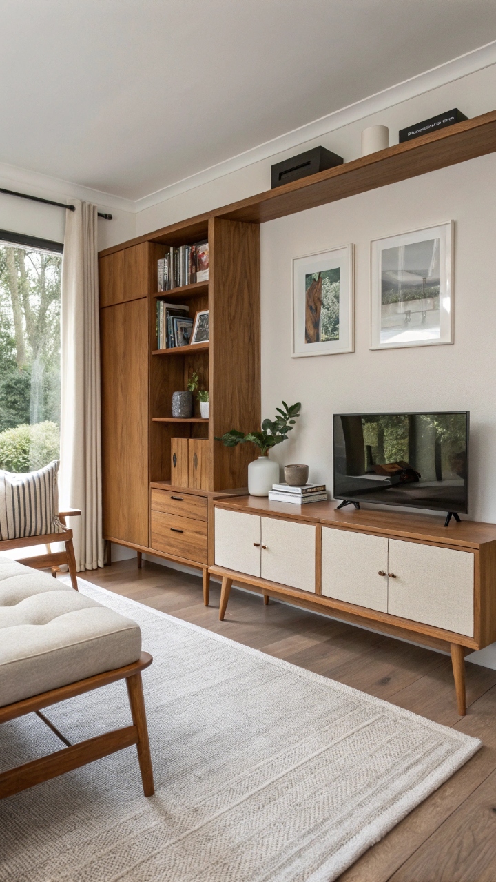
Hidden storage changed my entire relationship with small-space living because suddenly everything had a place—and no visual mess. I started using benches, console tables, and modular units that quietly swallowed clutter. The room instantly felt calmer, like it could finally exhale. No joke, it was a game changer. Mid century modern design makes hidden storage feel natural, not forced. Clean lines hide functionality beautifully. I realized the less I saw, the more I relaxed in the space. That’s when it clicked for me.
Pro Tip: Prioritize furniture with concealed storage to maintain clean, uninterrupted visuals.
Vertical Design That Draws the Eye Upward
One of my favorite tricks is using vertical elements to stretch the room visually. Tall curtains, vertical art, and elongated shelving all guide the eye upward. It’s subtle, but it creates this illusion of height that completely shifts perception. I started noticing my ceilings felt higher just by rearranging a few things. The key is consistency—don’t break the vertical flow halfway. I like keeping lines clean and uninterrupted wherever possible. It just makes everything feel more expansive. And honestly, it looks effortlessly stylish.
Pro Tip: Use floor-to-ceiling curtains to maximize perceived height instantly.
Decluttering Rituals That Keep Space Feeling Fresh
I used to think decluttering was a one-time thing, but small spaces taught me otherwise. Now it’s more of a rhythm than a task, like resetting the room every week. It keeps everything feeling light and intentional instead of slowly crowded. And yes, it’s oddly satisfying. There’s something emotional about letting go of things that no longer serve the space. The room feels different afterward—lighter, calmer, almost grateful in a way. It’s not about perfection, it’s about breathing room. And that makes all the difference.
Pro Tip: Do a 10-minute weekly reset to maintain openness and prevent visual buildup.
Conclusion
Small mid century modern living rooms have this quiet kind of magic that only shows up when you stop trying to fill every corner and start focusing on how the space feels instead of just how it looks. I learned that openness isn’t about size—it’s about intention, restraint, and choosing pieces that let the room breathe naturally. Once I shifted my mindset, even the smallest corners started feeling purposeful instead of limiting.
What surprised me most was how emotional the process became, because every small adjustment changed how I moved through the space and how I felt in it day to day. It stopped being just a living room and started becoming a place where I actually wanted to slow down and stay a while. That shift didn’t come from buying more—it came from editing better, and honestly, that was the real glow-up.
At the end of the day, mid century modern design taught me that simplicity isn’t empty—it’s clarity, and clarity feels like peace in a room that used to feel too tight. When everything has room to breathe, so do you, and that’s the kind of design that sticks with you long after the trend fades.